Brand Launch
Company: In:Haus
Work: Branding and Visual Identity
Team: Head of Creative: Amy Ruse
Deliverables: Launch brand into Market
As a creative, I had always wanted to start my own agency. The vision came from witnessing countless brands, especially hospitality, pay thousands of pounds to agencies that weren't able to convey the brands image or tone very well.
"In:Haus" means literally, in-house. The concept is to give brands the freedom of hiring freelancers with an in-house commitment and ability. To do such thorough investigation to the brands tone, ethos and goals, it truly felt like you'd hired someone in-house.
Visual Identity
It was important for the brands visual identity, to portray an aesthetic that resounded with it's target market. Focusing mainly on hospitality and lifestyle brands, I wanted to create something that showcased the versatility of my skills and style.
I paired modern and bold typography with contrasting colours and graphic design to produce something fluid and expressionable.
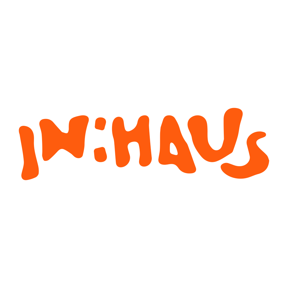
Logo concept
I was inspired to create my logo from various images I found that to me, personified fluidity. I feel that fluidity and adaptation perfectly summed up the brand ethos. I created the logo using illustrator and played around with anchor points until I felt the vector was playful enough, yet slightly imperfect. I felt that an imperfect attitude towards my creativity was what I wanted to portray. That you could still make something beautiful from something objectively ugly, through colour scemes and graphic placement. It was also important to me that the logo looked good over the brands imagery, and created a contrast in sharpness to the harsher characteristics of the film photography.
I think my logo capsulates a playful and modest symbol of what in:haus has to offer. It was almost a play on some scribbles, that actually look really great throughout the design pieces, eluding to the idea that even though something has been done in-house, probably on a budget, I still had the capabilities to turn it into something that could be taken seriously. It was important to me that the logo worked well alongside different formats of copy, and wasn’t bound to a monochrome colour palette. By incorporating varying luminous primary colours, I felt like it gave the logo some life. It felt less two dimensional.
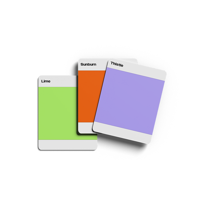
Colours
Vibrancy and expression is at the heart of what In:Haus stands for, and I combined rich, contrasted colours with monochrome overlays to produce a fun and eyecatching palette.

Feed Design
As part of the design process, I wanted to test the branding across different platforms. This was to ensure that all design elements were versatile under the test photo overlays, grid aesthetic and readability.
The feed combined mixed media to showcase the versatility of skills In:Haus has to offer. Typography is to be clear and readable from the feed visual, the brand easily identifiable and repetition of the brands logo and messaging for consistency and awareness.
I wanted to encapsulate the visual identity of In:Haus on one screen, allowing the viewer to completely understand the brands purpose and ethos in one glance.